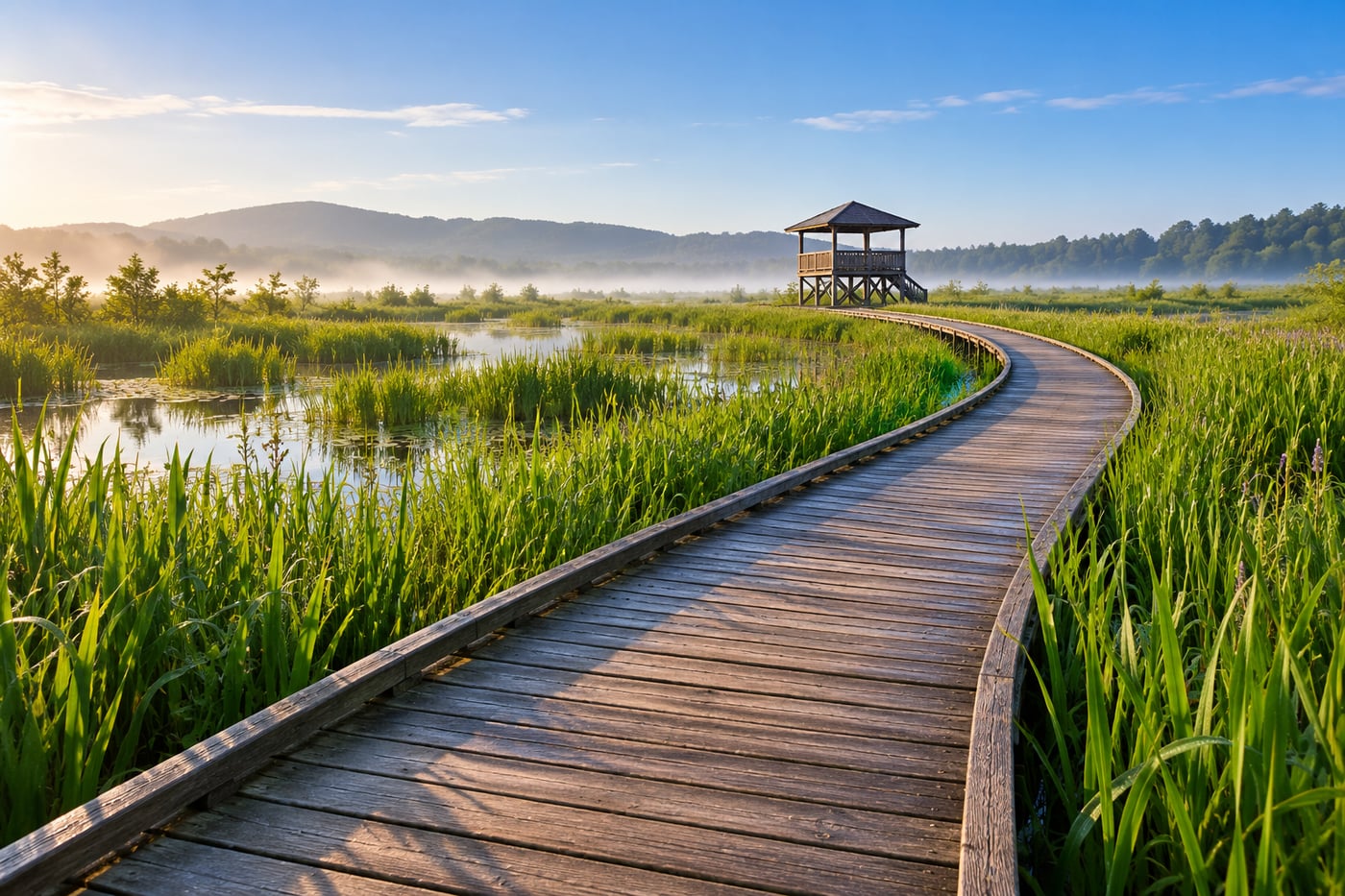
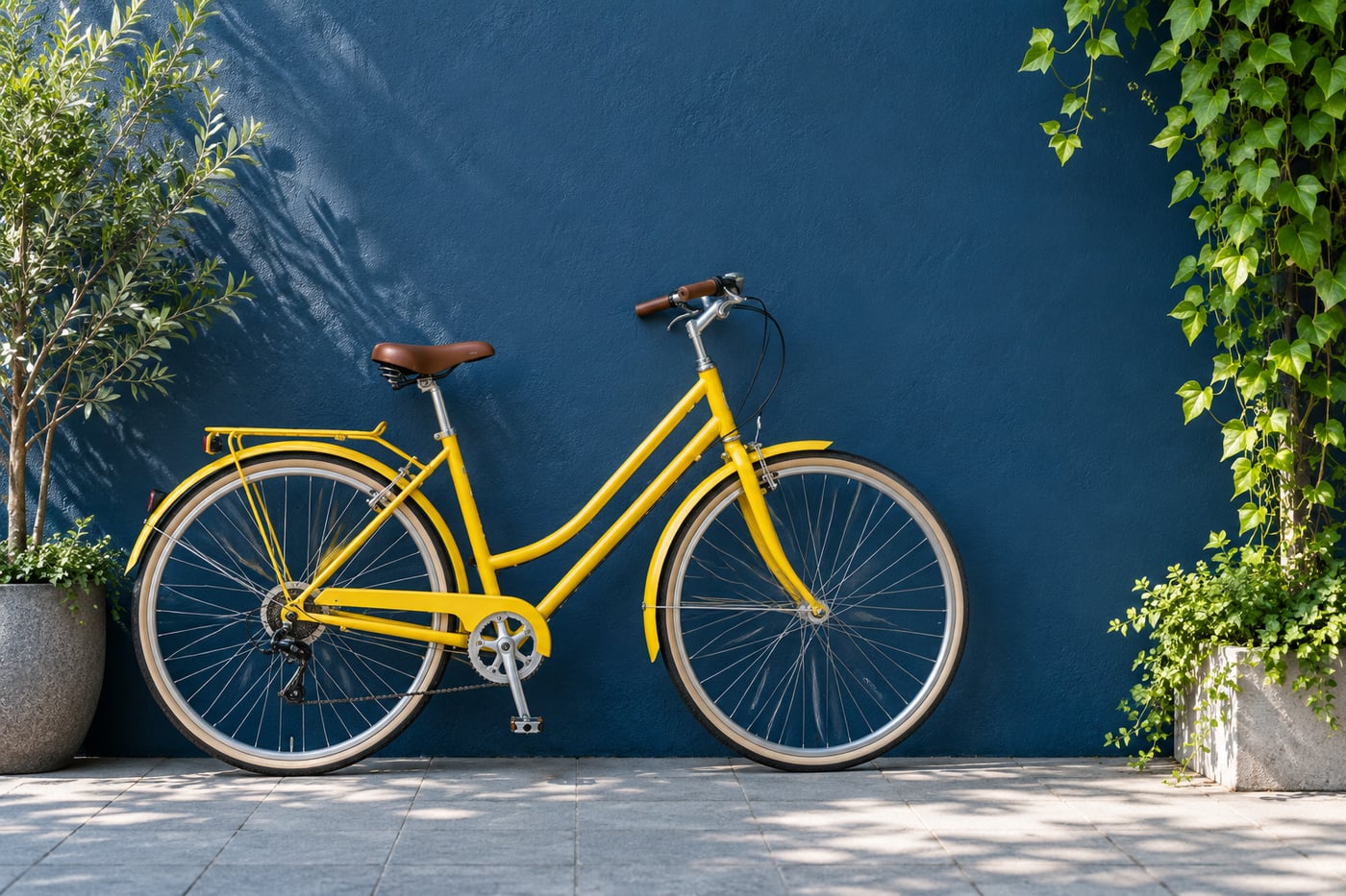
A lone tree against a pale sky can feel deliberate. A tiny tree lost in a large, untidy field can feel like you forgot to zoom in. Both photographs have plenty of space. The difference is whether that space helps you notice the tree and understand its surroundings.
Negative space is the quieter area around your subject. It can be textured water, a shaded wall, mist, or an even patch of foliage. It does not have to be blank, white, or completely out of focus. The useful question is what that area contributes to this particular photograph.
Choose a subject you can identify quickly
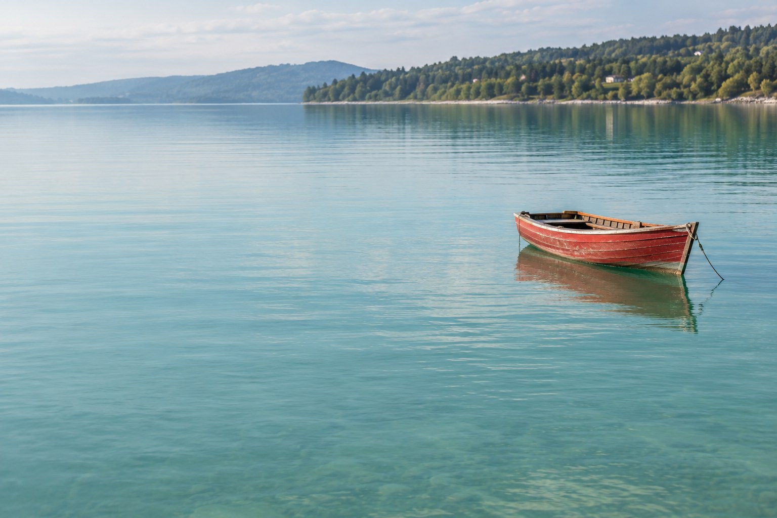
Start with one shape: a bench, a flower, a standing person, or a small boat. Before widening the frame, make sure its outline separates from the background. A dark bench against a pale wall is easy to read. The same bench against tangled dark branches may disappear even when you leave room around it.
For your first attempt, choose a scene with a fairly simple surface behind the subject. You are practising placement, so a quiet wall is a more manageable starting point than a busy market. You can return to complex scenes once you know what you are looking for.
Find the quiet area before deciding on a crop
Look beyond the subject. Is there one part of the wall with fewer marks? Does a small change in height place the boat against water rather than the far shore? Can you move so a lamp or bright sign leaves the frame?
Pay special attention to tiny bright objects near the edges. A white scrap in an otherwise dark frame can compete with a much larger subject. Do this check through the camera; a background that feels calm when you look around may contain several distractions inside a rectangle.
You can use soft focus, but blur is not a substitute for this check. A bright blurred shape still has brightness, colour, and visual weight. Try the changes in simplifying a busy background before opening the aperture further.
Put the room where it tells the story
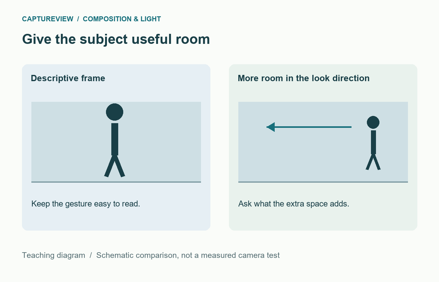
When a person looks to the left, space on the left may make the portrait feel open. Put the person close to the left edge instead and the frame can feel more constrained. Either can work. Make the choice because of the expression or situation, rather than because a grid tells you where a head belongs.
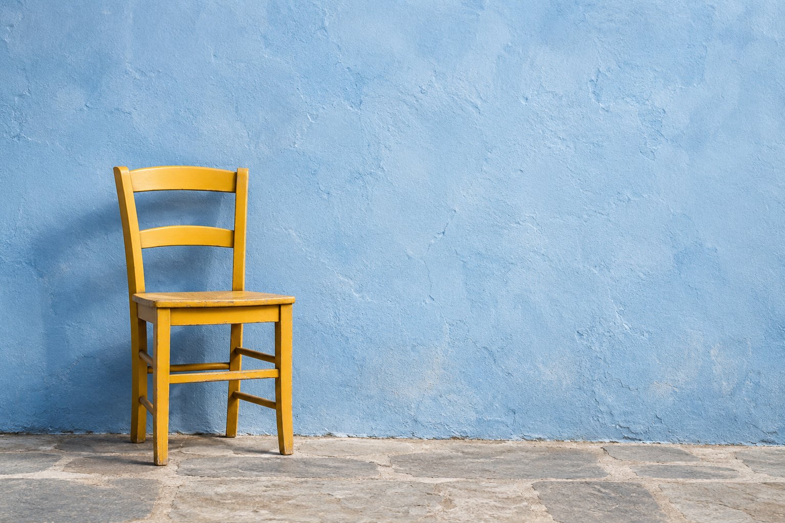
With a stationary object, there may be no obvious direction. Try space above a small building to emphasise a tall sky, or beside a chair to show the scale of an empty room. A centred object surrounded by equal space can feel quiet and formal. You do not have to place every subject on a third.
Watch for an accidental half-step: a little unused room on every side, without enough room to establish scale or enough closeness to reveal detail. A noticeably wider or tighter frame often makes the intention clearer.
Keep enough subject to survive a small screen
A person who looks clear on a large monitor may become an unrecognisable dot on a phone. Shrink your preview to the likely display size. Can you still tell what matters? If the photograph depends on a facial expression, a very small figure may not carry it.
That does not mean small subjects are wrong. A tiny walker below a large hillside can explain scale without showing a face. Decide whether you need identity, gesture, or simply a human-sized reference. Then give the figure enough size and contrast for that job.
Make three frames, not twenty near-identical ones
- Make a descriptive frame. Let the subject occupy a comfortable amount of the picture. Keep this as your reference.
- Add purposeful room. Widen the view or step back safely, placing most of the extra space on one chosen side.
- Push the idea. Make a clearly wider version. Watch what enters the edges and whether the subject remains readable.
Keep exposure and light similar. Compare all three at the same screen size. Name what the extra area adds: scale, direction, distance, solitude, a setting, or a repeated pattern. If you cannot name anything and the subject is harder to see, try the middle or tighter frame.
When the empty part keeps attracting attention
A large pale sky can overpower a small dark subject even when the sky has no detail. Try changing your position, using a quieter background, or reducing the amount of sky. Darkening the whole picture may only make the subject less readable.

A tilted horizon is especially obvious when surrounded by quiet space. Straighten it when a level horizon suits the scene, then check the crop again: rotation can cut more from the edges than you expect. For landscape choices, see where to place the horizon.
Compare the wider and tighter frames at the intended display size. Keep the extra space if it adds scale, direction, or setting while leaving the subject recognisable. There is no required percentage of negative space.
Sources and further reading
Adobe: negative space photography provides further examples of subject and surrounding space. The three-frame comparison here is a practical exercise, not a fixed composition rule.