Category: Editing

Practical photo editing lessons on exposure, white balance, cropping, and a careful workflow.

  • Why Do My Sharpened Photos Have White Edges?

    Why Do My Sharpened Photos Have White Edges?

    Published: Updated:

    A roofline looked clean before editing. After sharpening, a pale outline separates it from the sky. The picture seems crisp at first glance, but the edge starts to look cut out. You have probably strengthened an edge more than the image needs.

    Sharpening often increases contrast around transitions between light and dark. Pushed too far, that treatment produces a visible bright or dark rim, usually called a halo. It can emphasise existing detail, but it cannot reliably turn a genuinely out-of-focus photograph into a sharply captured one.
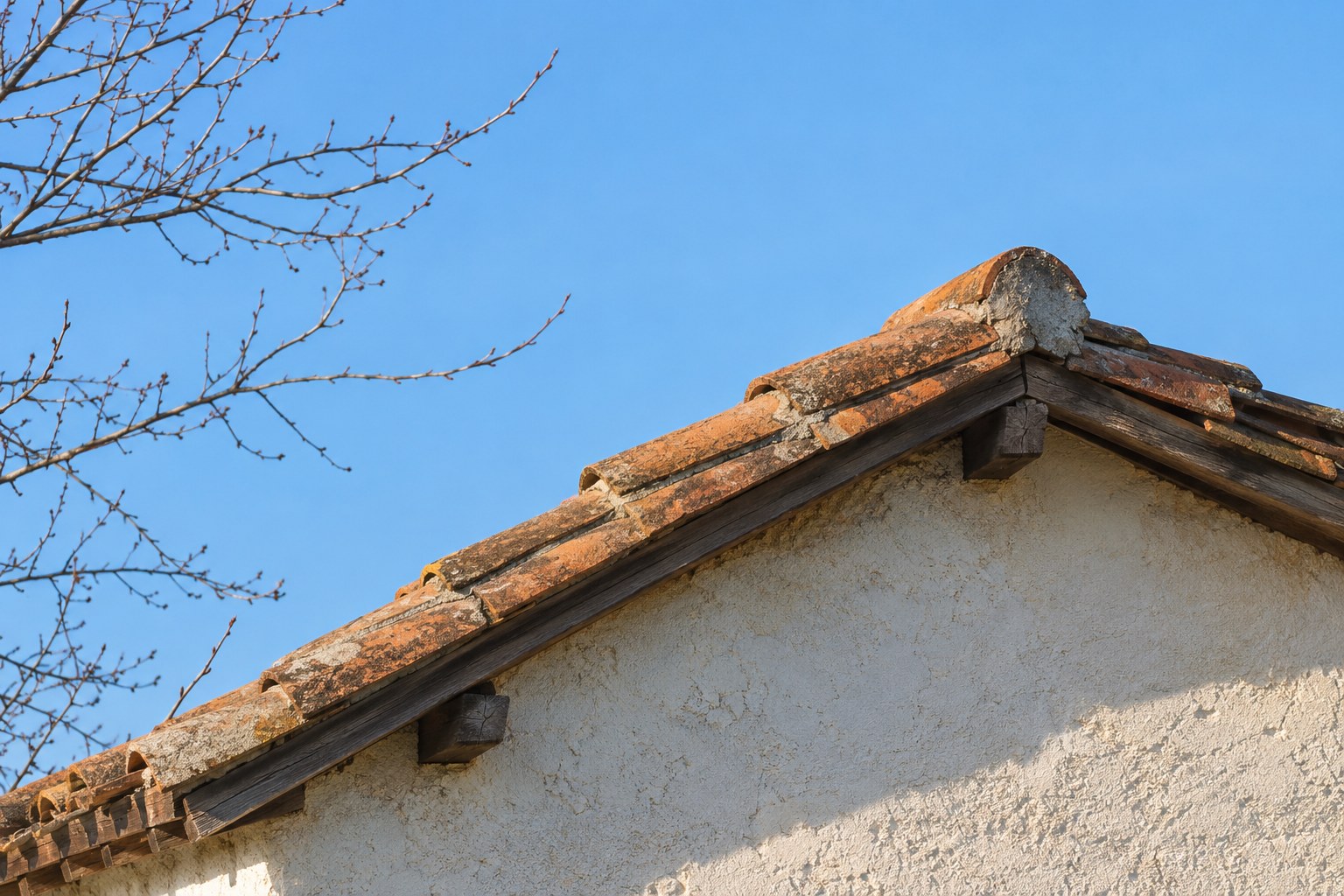
    Terracotta roofline and fine bare branches against a blue sky
    Inspect roof edges and fine branches for bright rims after sharpening, then check the exported file. AI-generated teaching illustration; the exaggerated halo comparison is shown separately below.

    Check whether the rim is actually new

    Return to the original or temporarily disable the edit. Compare the same edge at the same magnification. If the pale outline was already there, sharpening may have exaggerated it rather than created it. Bright backlighting, lens effects, colour fringing, compression, and local adjustments can all complicate the diagnosis.

    Look at more than one area. A thin bright edge around every branch suggests a different problem from a broad glow along only the boundary of a sky mask. Avoid treating every light outline with the same slider.
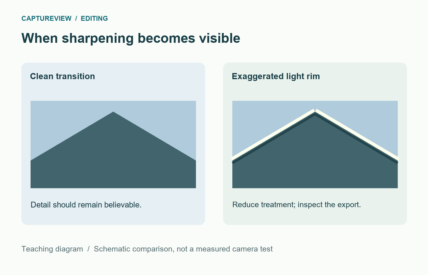
    Roofline comparison with a clean transition and an exaggerated pale sharpening halo
    The light rim is exaggerated to make the artifact visible. Compare your actual image at 100% and at its intended display size.

    Reduce sharpening before adding another correction

    In Lightroom Classic, inspect the image at 100% and work in the Detail panel. Lower Amount to see whether the rim weakens. Then compare Radius. A radius that is too large for fine branches or small facial details can make the treatment look obvious.

    Keep the changes separate. If you lower Amount, Radius, and Detail together, you may improve the picture without learning which control caused the problem. Start with the suspected setting, compare, and then make the next change if needed.

    Adobe describes Radius as the size of detail affected and warns that an excessive radius can look unnatural. Amount controls edge definition, while Detail changes how strongly fine information is emphasised. These names are specific to the application; other editors may organise similar controls differently.

    Do not sharpen the sky just because you sharpen the roof

    A smooth sky or a softly blurred background rarely needs the same treatment as a detailed building. Lightroom Classic’s Masking control can restrict sharpening towards stronger edges. Hold Alt on Windows or Option on macOS while adjusting it to inspect the mask preview: white areas receive the treatment, while black areas are protected.
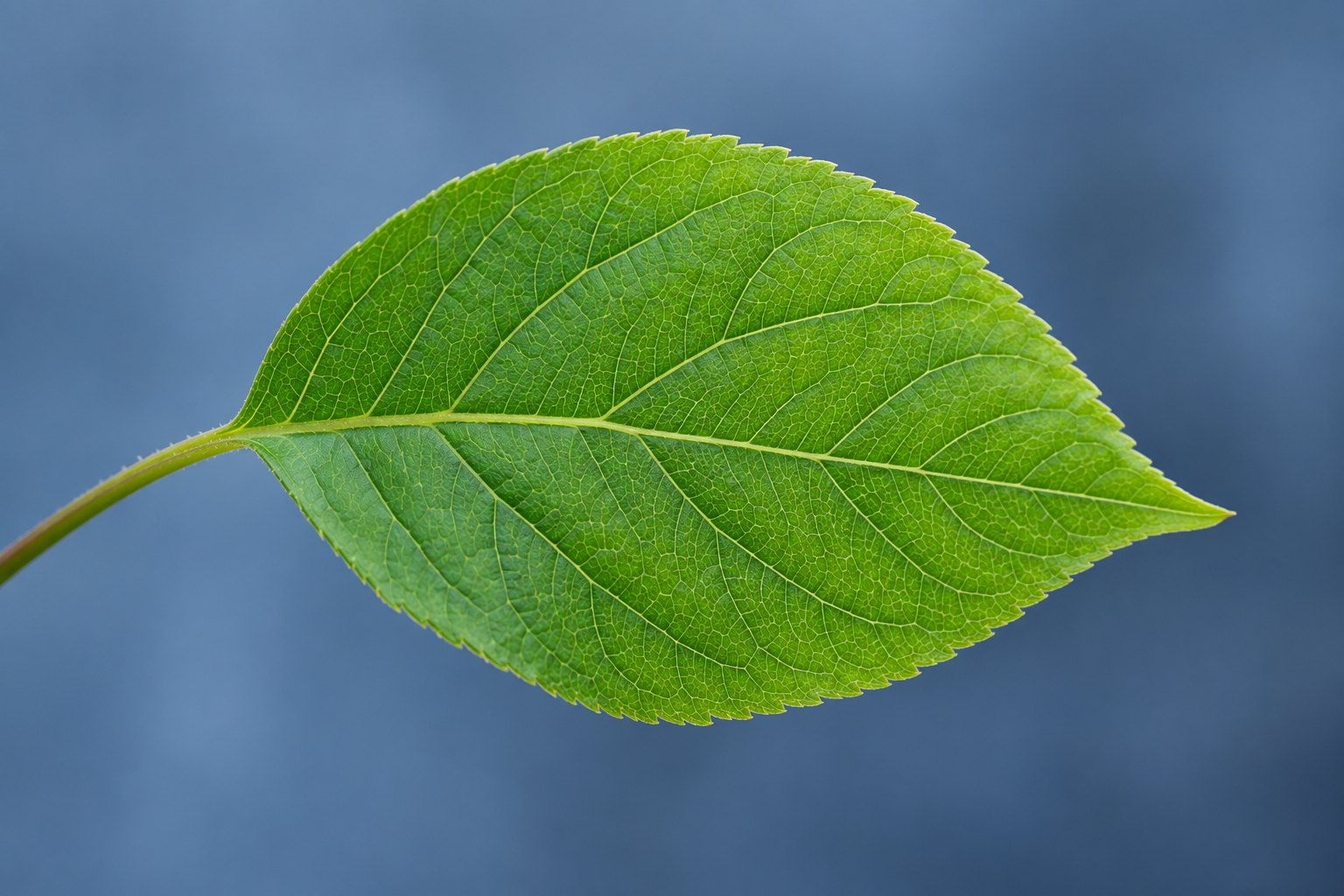
    Fine green leaf veins and a clean outline against a smooth blue background
    Inspect useful detail in the leaf while protecting the smooth background from unnecessary sharpening. Check the edge for a pale rim. AI-generated teaching illustration.

    This sharpening mask is separate from the local Masking workspace used for subjects, skies, brushes, and gradients. Confusing the two can make tutorials difficult to follow. Start by finding the Sharpening controls inside Detail.

    Masking is not a cure for an oversized halo on the very edge you have selected. If the roofline is white in the sharpening mask, excessive Amount or Radius can still affect it. Reduce the underlying treatment first.

    If sharpening is off and the outline remains

    Temporarily disable local masks one at a time. A strongly darkened sky beside an unchanged tree can expose a broad boundary. Check the mask coverage at branches and soften or refine the transition as your editor allows. Avoid painting a bright outline around the tree to hide a dark one.

    Next compare strong Clarity, Texture, Dehaze, or similar local-contrast adjustments. They work at different scales and do not all behave like sharpening, but an aggressive combination can make edges look harsh. Reset one suspect control, inspect, and restore it if it was not responsible.

    If the outline is distinctly purple or green, inspect the lens-correction tools instead. Colour fringing is not the same as a neutral sharpening halo, and reducing all detail may only soften the photograph without solving the colour.

    Inspect the exported file, too

    Resizing changes the detail available in a picture. Output sharpening then acts on the version you export. A small JPEG may look harsh even when the full-resolution editing preview seems acceptable.
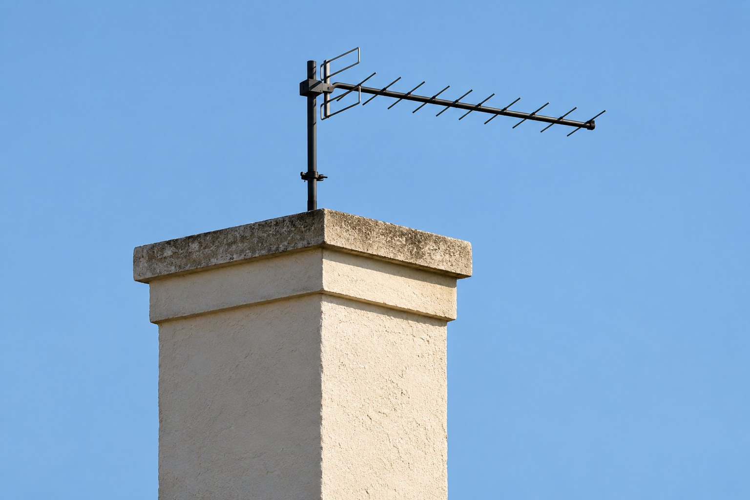
    Cream chimney and thin dark aerial forming clear edges against the sky
    Fine aerial lines and the chimney boundary are useful areas to inspect for halos at 100%, then again after export. AI-generated teaching illustration.

    Export two otherwise identical copies at your intended pixel dimensions: one without output sharpening and one with a modest output setting. Open both at 100% and also at their normal display size. If only the sharpened export has the rim, reduce or disable output sharpening. If both have it, return to the main edit.

    Keep the original file and editable version. Do not repeatedly open, sharpen, and overwrite the only JPEG. Recompression makes later comparisons harder and can introduce artifacts of its own.

    A ten-minute edge test

    1. Choose a photograph with a roof, trunk, or other clear edge against an even background.
    2. Create a virtual copy or duplicate edit so the original remains available.
    3. At 100%, lower sharpening Amount and note whether the light rim changes.
    4. Return to the starting version, reduce Radius, and compare the same edge.
    5. Check a textured area and a smooth area before choosing the gentler version.
    6. Export at the size you actually need and inspect that file rather than judging only the editor preview.

    Keep a short note of the control that changed the rim. There is no useful universal sharpening recipe across every camera, crop, subject, and output size. The point of the test is to recognise when the treatment becomes visible.

    Choose detail over the appearance of crispness

    When skin looks gritty or leaves turn into brittle outlines, back off and compare with the original at a normal viewing size. Compare the edited file with the original at its intended display size before deciding whether the extra crispness improves the detail.

    Use a restrained editing pass to check the rest of the picture. If the original has directional smearing or missed focus, review it with the photo-review routine and change the capture next time. Sharpening should help the detail you recorded remain readable, without drawing attention to the processing.

    Sources and further reading

    Adobe Lightroom Classic: retouch photos, sharpening and noise reduction documents Amount, Radius, Detail, and Masking. Control names and placement may differ in other editors.
  • Why Your Photos Look Orange Indoors and What to Change

    Why Your Photos Look Orange Indoors and What to Change

    Published: Updated:

    The room looks comfortable, but everyone’s skin looks orange in the photograph. Warm lamps can create that colour, especially when the camera uses a daylight white balance. Start with the light sources before pushing saturation down.

    Keep the lighting steady

    Steady indoor light during the comparison. Compare white-balance settings while the subject and light sources stay in place. Daylight from a window and a warm lamp can affect different parts of a face, so one global adjustment may not solve the whole image. A neutral reference helps only when it receives the same light as the subject.

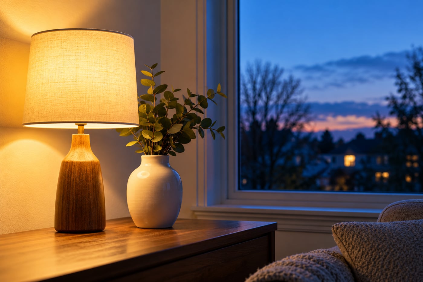
    Warm lamp and white vase beside a blue dusk window
    AI-generated teaching illustration. It shows the scene discussed here, not a measured camera test.

    Identify the light on the subject

    A face beside a window may receive blue daylight on one side and warm lamp light on the other. One white balance setting cannot always make both sides neutral.

    When practical and safe, make a frame with both sources, then switch off the conflicting lamp and repeat. You can also move the person towards one source or change the viewpoint to reduce the mixture. Compare the colour on each side of the face.

    Try Auto or an appropriate preset

    Auto white balance is a useful starting point. A tungsten or incandescent preset is designed for certain warm lamp conditions, but modern bulbs vary and a preset may overcorrect.

    If your camera allows Kelvin adjustments, a lower setting generally renders the same scene cooler. Move gradually and review. A specific number is not a universal solution for every room.

    Use a reference carefully

    A genuinely neutral object under the same light as the face can help judge colour. A cream wall is not necessarily white, and a white object in different light can give a misleading reference.

    Some cameras support custom white balance from a neutral target. Follow the manual and keep the target under the subject’s lighting conditions.

    Keep some warmth when it belongs

    A candlelit or cosy indoor scene does not need to look like midday outdoors. Aim for skin and surroundings that support the scene. Reducing every warm tone can remove the atmosphere you wanted.

    Compare the correction with the original at the same brightness. Colour decisions are harder when one version is much darker.

    Correct the file without creating another problem

    RAW offers more flexibility for white balance than a processed JPEG. A JPEG can still be adjusted, but strong corrections may leave less natural colour or visible artefacts. Keep the original before editing.

    If only one side of a face has a cast, a local correction may help, though improving the lighting at capture is preferable when possible. See files and white balance and restrained editing.

    Practise with Auto, a lamp preset, and one manual adjustment under steady lighting. Choose deliberately; the coolest frame is not automatically the most accurate.

    Related lessons

    Sources and further reading

    Adobe: white balance and RAW processing.

  • How to Edit a Photo Without Making It Look Overprocessed

    Published: Updated:

    The sky is electric blue, the grass is almost fluorescent, and every edge has a bright outline. Each slider may have looked better on its own. Together, the changes have pushed the photograph further than you intended.

    Set up a fair comparison

    One original file and a consistent viewing setup. Keep an untouched original and compare versions at the same size and brightness. A screen with an unusually vivid colour mode can make a restrained edit look more saturated than it is. The exercise is about judging this photograph, not finding one preset that suits every subject.

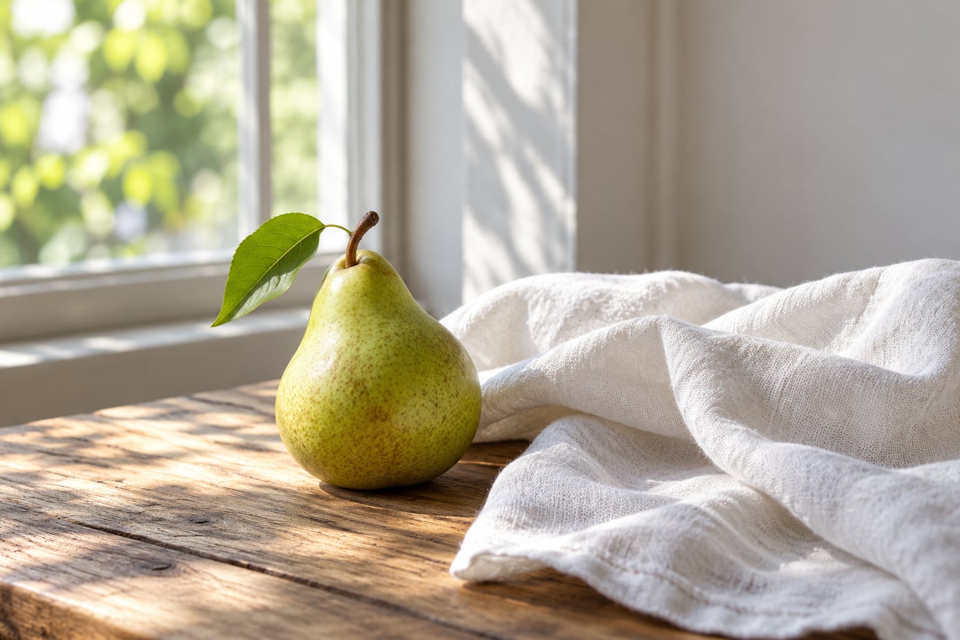
    Pear and white linen in restrained natural window light
    AI-generated teaching illustration. It shows the scene discussed here, not a measured camera test.

    Start again with two specific problems to solve. Perhaps the face is dark and the horizon tilts. Fix those before adding a preset.

    Keep an untouched original

    Use editing software that preserves the original, or work on a copy. Keep the full-resolution file. Save a separate export for sharing so you can return to the photograph later without relying on a compressed copy.

    Set the frame before fine adjustments

    Check the horizon and edges. A small crop may remove a distraction, but a tight crop can also lose the setting that explains the subject. Compare at the same viewing size.

    Leave enough space around hands, feet, and faces when it suits the composition. Watch whether straightening has cut something important from a corner.

    Adjust brightness with a subject in mind

    Look at the area you want the viewer to notice. Increase overall exposure only if the whole image needs it. If the face is dark but the sky already looks bright, a selective adjustment may be more suitable than brightening everything.

    Do not force every shadow to show equal detail. Shadows can give a scene shape. Check highlight warnings when available, but remember that a reflection or light source may legitimately be very bright.

    Choose colour before adding saturation

    If a white wall looks blue or a face looks orange, inspect white balance first. Increasing saturation makes a colour cast stronger.

    Use a neutral object as a reference when appropriate, while remembering that warm evening light may be part of the scene. Mixed light can require local adjustments because one global setting cannot correct every area equally.

    Check texture at a useful size

    Sharpening can help edges look clearer, but too much produces halos and brittle detail. Noise reduction can smooth grain while also smoothing fine texture. Inspect a detailed area at high magnification, then return to normal viewing size.

    Do not judge the whole edit at an extreme zoom level. The photograph needs to work at the size where people will see it.

    Use the original as a regular comparison

    Toggle between the edit and original after a few changes. If everything became brighter, more colourful, and more contrasty, ask which of those changes actually helped the subject.

    Take a short break. Your eyes adapt to strong colour and contrast, so an edit can look restrained while you work and excessive when you return.

    Export and inspect the exported file

    For ordinary web sharing, JPEG in sRGB is a practical choice. Use dimensions suited to the destination, inspect detail after resizing, and avoid repeatedly overwriting the only JPEG copy.

    Make a small edit of one photograph and write down the two problems you solved. Reduce any adjustment you cannot explain, then compare the versions at normal viewing size.

    Continue with the editing lesson and RAW, JPEG, and white balance.

    For this practice, choose a file with a neutral surface and a coloured subject. Compare brightness and white balance before adding local contrast. If colour changes between the editor and the exported file, check the export colour space and viewing application before adding saturation.

    Related lessons

    Sources and further reading

    Adobe: Camera Raw adjustments.

© 2026 CaptureView. All rights reserved.