Author: admin

  • Why Are My Handheld Photos Blurry Even When Nothing Is Moving?

    Why Are My Handheld Photos Blurry Even When Nothing Is Moving?

    Published: Updated:

    You photograph a bookshelf in a quiet room. Nothing is moving, the camera confirms focus, and the picture looks fine on its small screen. At home, the lettering on every book is soft. A still subject does not guarantee a sharp photograph: your hands can move the camera while the shutter is open.

    Before buying anything or adding sharpening, find out what kind of softness you have. This lesson is for handheld photographs of genuinely still objects. For a walking person, a pet, or leaves blowing in the wind, subject movement adds a different problem.

    Look for the shape of the blur

    Open one original file and inspect a detailed area at 100% magnification. Choose printed lettering, a brick edge, or a window frame. Then look at another part of the image at a similar distance from the camera.

    • Several edges trail in the same direction: camera movement is a likely cause. The amount may vary across the frame, particularly when the camera rotates.
    • Something in front of or behind your subject looks sharper: check where the camera focused. A green confirmation box means it acquired focus somewhere, not necessarily on your intended detail.
    • A thin slice is sharp while nearby details soften gradually: you may simply have less depth of field than the subject needs.

    These are clues, not a perfect diagnosis. Blur types can overlap. A controlled comparison is more useful than trying to identify everything from one photograph.
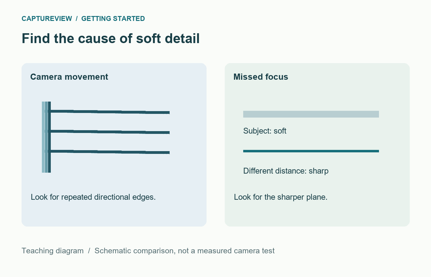
    Diagram contrasting repeated directional edges from camera movement with a sharper plane at a different focus distance
    Directional smearing and a misplaced focus plane are different clues. This schematic illustrates the distinction; it is not a measured camera test.

    Give yourself a faster shutter speed

    For a short or normal lens, try 1/250 second as a deliberately conservative test in reasonable light. With a long lens, heavy cropping, or an unsteady stance, try a faster speed. The familiar reciprocal-focal-length guideline is a starting point, not a personal sharpness guarantee. Sensor size, resolution, viewing size, support, and stabilisation all affect the result.

    Use shutter priority and Auto ISO if your camera provides them. Select 1/250 second, focus carefully on the book lettering, and take three separate pictures. Check whether the camera has enough light: if the aperture display flashes or you reach an ISO limit, the result may be underexposed. Move closer to a bright window or use a wider aperture before continuing.

    If you prefer aperture priority, watch the shutter readout as the room gets darker. An aperture of f/8 may leave the camera using 1/15 second without drawing your attention to it. The setting that worked outdoors can become a problem indoors.
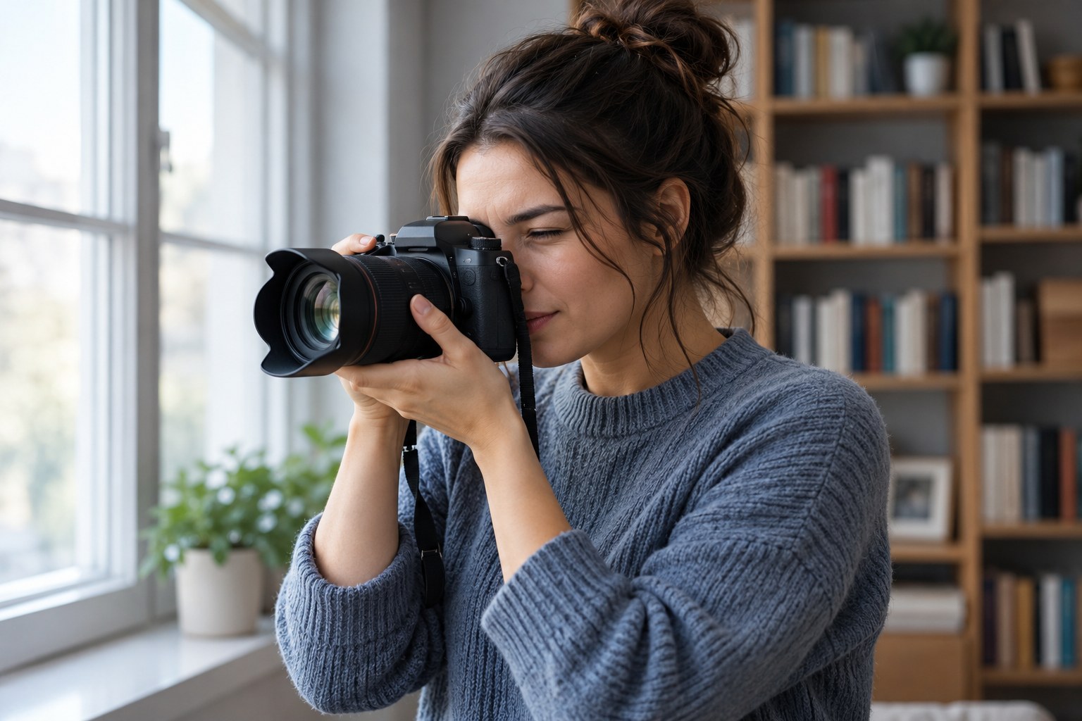
    Person supporting a camera lens from below while using the viewfinder beside a window
    Support the lens from below and keep the camera close to your body. AI-generated teaching illustration; no shutter-speed performance is measured.

    Hold the camera without fighting it

    Support the lens or camera base with your left hand, keep your elbows reasonably close, and press the shutter gently. Stand with balanced feet instead of leaning at full stretch. Bring a viewfinder to your eye when that gives you an extra point of contact. With a screen, avoid holding the camera as far away as your arms will reach.

    A wall or a stable tabletop can help, provided you have permission to use it and the camera cannot slide. Do not lean onto a railing that vibrates whenever someone walks past. Take the picture during a natural pause in your breathing rather than forcing an uncomfortable breath hold.

    What stabilisation can and cannot change

    Optical or sensor-based stabilisation can reduce the effect of camera shake. It cannot hold a moving person still. Check that the feature is enabled for handheld use, and follow your camera or lens instructions for any activation delay and tripod behaviour. Do not assume a quoted number of stabilisation stops is a promise for every photograph.

    Phones can combine several exposures, so a bright preview may disguise a longer capture process. In a dim room, hold the phone steady until capture finishes. For this exercise, use the main camera without digital zoom and clean the lens with a suitable cloth first.

    A six-picture test you can repeat

    Choose a flat, detailed subject in steady daylight. Keep your distance and focal length fixed. Use shutter priority, Auto ISO, and the same focus point. Make three frames at 1/60 second and three at 1/250 second. Avoid a close subject or an extremely wide aperture that would make depth of field the main variable. If changing aperture affects the comparison, repeat in manual exposure with a fixed aperture and Auto ISO, if supported.
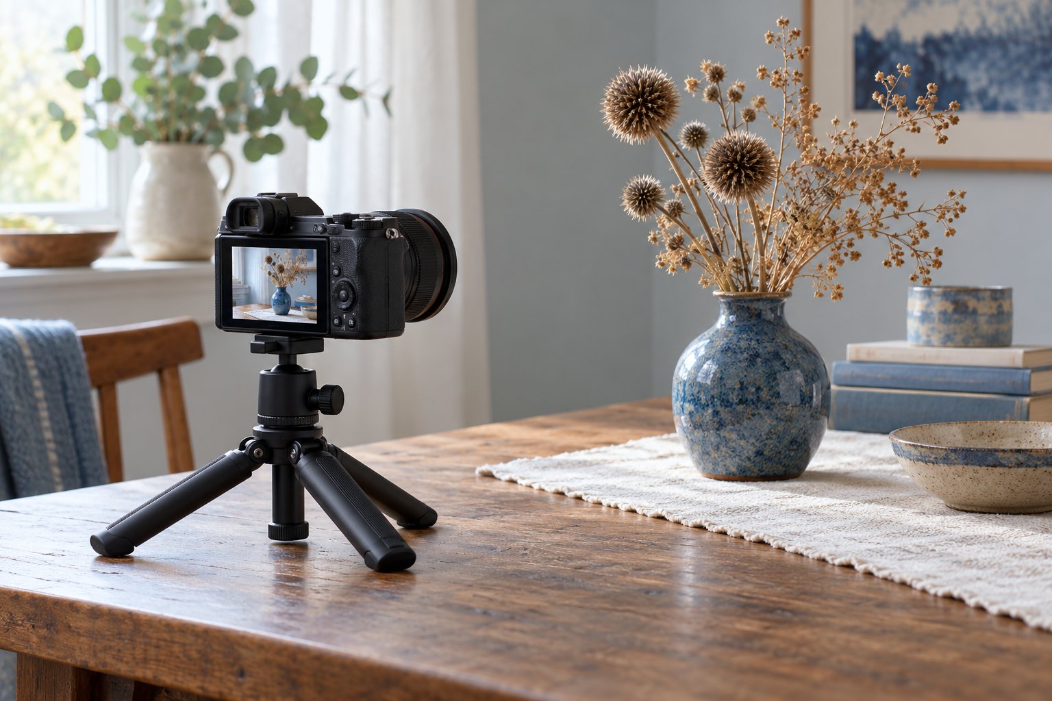
    Camera on a low tripod aimed at a still ceramic vase beside a window
    For a supported comparison, keep the camera secure and the subject still. A short timer can remove your touch from the exposure. AI-generated teaching illustration.

    Compare the lettering at the same magnification. Count usable frames in each set rather than selecting only the best one. If the faster group is consistently clearer, you have a practical shutter-speed starting point for that lens and stance. If both groups are soft, use a stable support and check focus again.

    When speed does not solve it

    If another distance is sharp, work through choosing an autofocus area for a still subject. If your aperture or ISO keeps changing unexpectedly, read what to check in aperture priority. When the background is sharp but a person is blurred, use the separate lesson on subject movement.
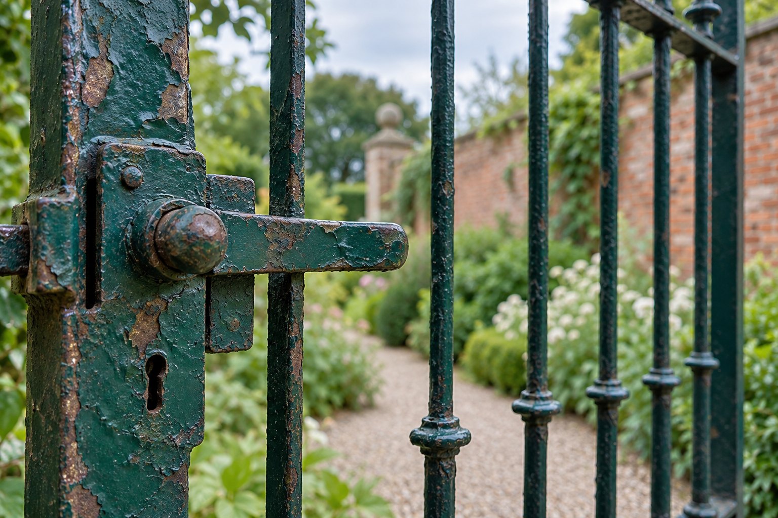
    Near gate latch and peeling green paint in focus with a more distant garden wall softened
    Inspect the intended detail and another distance. A sharper background can point to misplaced focus rather than hand movement. AI-generated teaching illustration.

    Compare the files at the size you plan to share. Visible noise may be acceptable if the intended detail is sharp; keep the originals for a closer check of noise and blur.

    Sources and further reading

    Nikon: Vibration Reduction explains camera-shake compensation. Features and performance differ by model; use your own manual for operating instructions.
  • Why Your Photos Look Orange Indoors and What to Change

    Why Your Photos Look Orange Indoors and What to Change

    Published: Updated:

    The room looks comfortable, but everyone’s skin looks orange in the photograph. Warm lamps can create that colour, especially when the camera uses a daylight white balance. Start with the light sources before pushing saturation down.

    Keep the lighting steady

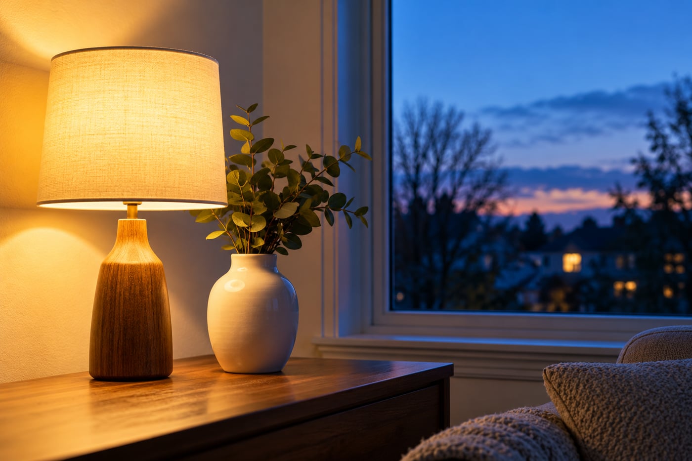
    Steady indoor light during the comparison. Compare white-balance settings while the subject and light sources stay in place. Daylight from a window and a warm lamp can affect different parts of a face, so one global adjustment may not solve the whole image. A neutral reference helps only when it receives the same light as the subject.

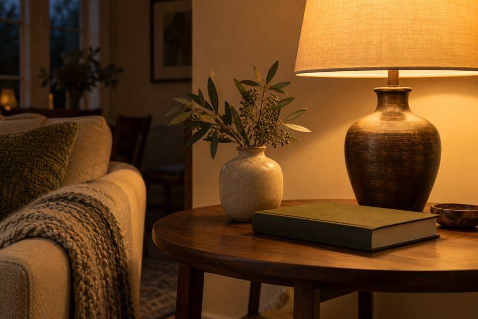
    Warm lamp and white vase beside a blue dusk window
    AI-generated teaching illustration. It shows the scene discussed here, not a measured camera test.

    Identify the light on the subject

    A face beside a window may receive blue daylight on one side and warm lamp light on the other. One white balance setting cannot always make both sides neutral.

    When practical and safe, make a frame with both sources, then switch off the conflicting lamp and repeat. You can also move the person towards one source or change the viewpoint to reduce the mixture. Compare the colour on each side of the face.

    Try Auto or an appropriate preset

    Auto white balance is a useful starting point. A tungsten or incandescent preset is designed for certain warm lamp conditions, but modern bulbs vary and a preset may overcorrect.

    If your camera allows Kelvin adjustments, a lower setting generally renders the same scene cooler. Move gradually and review. A specific number is not a universal solution for every room.

    Use a reference carefully

    A genuinely neutral object under the same light as the face can help judge colour. A cream wall is not necessarily white, and a white object in different light can give a misleading reference.

    Some cameras support custom white balance from a neutral target. Follow the manual and keep the target under the subject’s lighting conditions.

    Keep some warmth when it belongs

    A candlelit or cosy indoor scene does not need to look like midday outdoors. Aim for skin and surroundings that support the scene. Reducing every warm tone can remove the atmosphere you wanted.

    Compare the correction with the original at the same brightness. Colour decisions are harder when one version is much darker.

    Correct the file without creating another problem

    RAW offers more flexibility for white balance than a processed JPEG. A JPEG can still be adjusted, but strong corrections may leave less natural colour or visible artefacts. Keep the original before editing.

    If only one side of a face has a cast, a local correction may help, though improving the lighting at capture is preferable when possible. See files and white balance and restrained editing.

    Practise with Auto, a lamp preset, and one manual adjustment under steady lighting. Choose deliberately; the coolest frame is not automatically the most accurate.

    Related lessons

    Sources and further reading

    Adobe: white balance and RAW processing.

  • A Simple Photo Review Routine That Helps You Improve

    A Simple Photo Review Routine That Helps You Improve

    Published: Updated:

    You return with a hundred photographs and keep the sharpest one. That is a start, but it does not explain why the next session should be different. A short review can turn the files into useful feedback.

    Review one shoot at a time

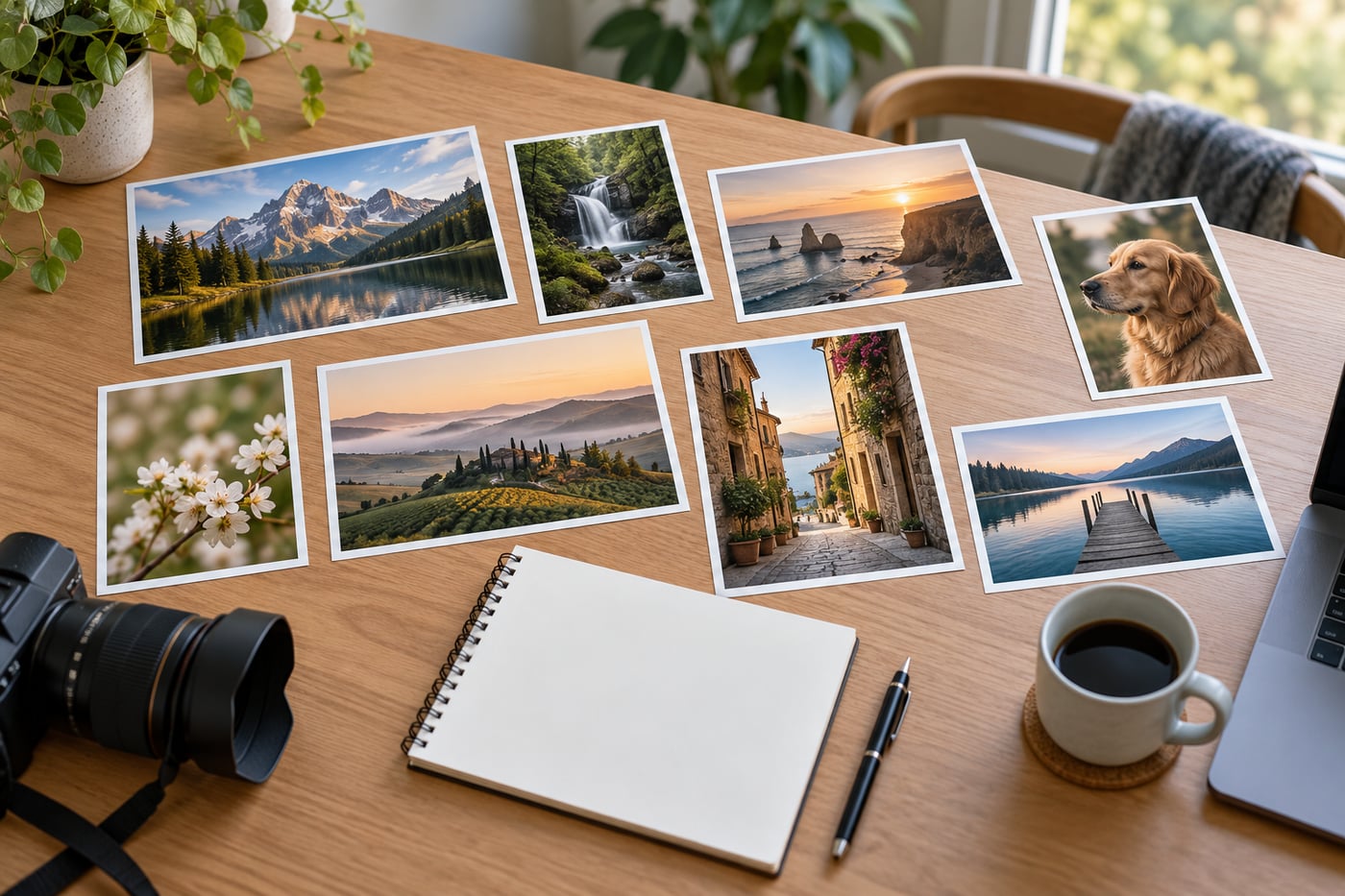
    A small selection from one shoot. Use a short set of photographs made in similar conditions rather than mixing unrelated shoots into the first review. Look at them at the same size, then inspect a few important details more closely. Write one observation you can act on next time; a long list of criticisms is harder to practise.

    Printed photographs arranged beside a notebook for review
    AI-generated teaching illustration. It shows the scene discussed here, not a measured camera test.

    Choose a small comparison set

    Pick three to five frames of the same subject or situation. Comparing unrelated photographs makes it harder to identify what changed. Include an imperfect frame if it illustrates a useful difference.

    View them at the same size and similar brightness. A larger or brighter preview can seem more appealing for reasons unrelated to the photograph.

    Ask what the photograph is about

    Look for the first thing you notice. Does it match your intended subject? A bright sign, an edge, or a background face may be pulling attention away.

    If the subject is unclear, choose a framing task for next time. Moving position or waiting for an overlap to clear may help more than changing camera settings.

    Check sharpness after judging the whole frame

    Magnify the important detail. Is the focus distance wrong, is the subject moving, or is there camera shake? Check recorded shutter speed, aperture, and ISO when available, after judging the image itself. This keeps impressive-looking settings from deciding which photograph you prefer.

    Do not reject an expressive photograph merely because an irrelevant corner is soft. Decide which details needed to be sharp for that photograph to work.

    Look at the light and timing

    Compare shadow shape and the bright areas. Which face direction or camera position used the light more effectively? For action or expressions, compare the moment rather than only the technical settings.

    A useful frame may have come from waiting, not from a new piece of equipment. Record that observation too.

    Write one reason to keep a frame

    “I like it” is a valid reaction but weak practice guidance. Try a concrete note: “The lower viewpoint removed the car behind the person,” or “The faster shutter kept the hand sharp.”

    Then write one thing to change. Avoid a list of ten faults that leaves you unsure what to practise first.

    Make the next task small

    If backgrounds caused trouble, make three viewpoints of one subject. If movement blurred the subject, compare two shutter speeds. If colour distracted, compare white balance under one steady light source.

    Keep the selected files and notes together, and preserve originals before editing. Use the first-week plan for structure and camera basics when a control needs explaining. Keep one observation with the selected files and use it to choose a task for the next session.

    If every note says “not sharp”, distinguish focus error from subject movement and camera shake. If you cannot explain an edit, compare it with the original and reduce one adjustment before adding another.

    Related lessons

    Sources and further reading

    Adobe: learning by comparing edits.

  • How to Photograph People in Open Shade Without Flat-Looking Light

    How to Photograph People in Open Shade Without Flat-Looking Light

    Published: Updated:

    Shade removes direct sun from the face, but it does not remove the direction of light. A person deep beneath a roof may have dark eyes, while the same person near the edge of the shade receives more light from the open sky.

    Look for a bright opening

    Open shade with daylight coming from one main direction. Look for an open edge of shade, such as the side of a building, rather than treating every shaded spot as equivalent. A person can look quite different facing the open sky or the dark wall. Coloured walls and foliage nearby may reflect a tint onto the face.

    Man in the shade of a stone arch facing the bright opening
    AI-generated teaching illustration. It shows the scene discussed here, not a measured camera test.

    Find shade that opens towards light

    Look for a doorway, the side of a building, or a shaded area with a clear view towards the sky. Stand where the person will be and look around. Which direction feels brightest?

    Keep the person fully out of direct sun. Small patches of sunlight through leaves can create distracting bright spots that move across the face.

    Turn towards the bright side

    Ask the person to turn a little towards the open light. Watch the eyes and the shadow beneath the brow. Compare a frame facing into the darker area with one facing towards the opening.

    You do not need perfectly even light. A gentle difference between the cheeks can give the face shape. Make small changes and let the person settle before shooting.

    Check the background separately

    A sunlit background can be much brighter than the shaded face. If you expose for the person, the background may lose detail. If you expose for the background, the person may look too dark.

    Change your position to place a less bright area behind the subject. Moving both photographer and subject can be easier than trying to preserve every tone with one exposure.

    Watch reflected colour

    A green lawn or coloured wall can reflect light onto skin. Auto white balance may reduce an overall cast, but it cannot always correct mixed colours evenly. Move away from the strongly coloured surface and compare.

    RAW gives more flexibility for processing white balance, but improving the light at capture is still useful. See white balance basics.

    Keep the person sharp

    Shade can mean less available light. Check shutter speed and ISO rather than assuming daylight is always bright enough. Focus on the nearer eye, and increase the shutter speed if expression or movement produces blur.

    Try three face directions in the same shaded spot. Compare eye light, cheek shadows, and skin colour. Then compare with the window-light portrait lesson. In both settings, compare the light in the eyes and the shadows on the cheeks before choosing the face direction.

    For a second comparison, keep the face direction steady and move the person farther back into the doorway. Compare the light in the eyes and the shadows beneath the brow with the frame made near the opening.

    Related lessons

    Sources and further reading

    Nikon: portrait lighting.

  • How to Use Leading Lines Without Pulling Attention Away From Your Subject

    Published: Updated:

    A path curves through a landscape. It looks promising, but the curve leads towards an empty corner while the tree you wanted to photograph sits elsewhere. Trace the line through the frame and check whether it leads towards the tree or away into the corner. That quick check gets at the real point of leading lines: they should help the picture communicate, not simply add a diagonal.

    Paths, fences, shorelines, rows of windows, shadows, and even a line of chairs can guide attention. They do not all guide it in the same way. Some point directly at a subject; others create depth or give the eye a route through a busy scene. Before composing, decide what you want the viewer to notice first. Then see whether the line supports that choice.

    Find a line you can frame safely

    A clear subject and a line that is visible from your position. The exercise works with a path, fence, shoreline, or architectural edge that can be framed without entering an unsafe area. Check where the line appears to end in the photograph, not just where it runs in the real scene. A strong line may compete with a small or poorly lit subject.

    Curved boardwalk leading through marsh grass to a lookout
    AI-generated teaching illustration. It shows the scene discussed here, not a measured camera test.

    Choose the subject before the line

    Decide whether the photograph is about the tree, the path, or the place as a whole. A line can point towards a subject, frame it, or carry the viewer through the scene. Those are different uses. If the path itself is the subject, let it occupy enough of the frame to show its shape. If it is meant to lead to a person, make sure that person is easy to find and has enough visual weight to hold attention.

    Look at the image briefly, then look away. Where did your eye go first? If the brightest railing grabbed attention and never led you back, it may be competing with the subject. Try a lower angle, a step to either side, or a frame that includes less of the railing. Do not assume a strong line is automatically a useful one.

    Follow the line to its end

    Trace a path, shoreline, shadow, or wall with your eyes. Check its start, direction, and ending. A strong line that exits the frame can be intentional, but it can also make the image feel unfinished. A line that arrives at a bright sign, a cut-off object, or a patch of empty ground may become the picture’s destination whether you intended it or not.

    Watch for interruptions. A parked car or sign might become the accidental destination of an otherwise useful line. In a street scene, a crosswalk can point towards a person, but it can also pull attention to a vehicle at the edge. Review the whole path your eye takes rather than judging only the line’s shape.

    Move before cropping

    Changing height can alter how a foreground line meets the subject. Moving sideways can separate a railing from a person or align a curve with a distant feature. Even a small shift can change overlaps: two objects that merge from one spot may separate when you move a few steps.

    Take a frame, then make a second after one small movement. Compare at the same size. Avoid large changes at first so you can tell what the viewpoint did. If you have time, make one frame from your original position, one slightly left or right, and one a little lower. Choose the clearest relationship, not the most dramatic angle.

    Give the line the right amount of space

    Including its entire length is not always necessary. A short section may suggest direction without dominating. Conversely, cropping its entrance at an awkward point can remove the sense of movement you wanted. Check whether the line appears to begin naturally inside the frame or seems to have been cut off by accident.

    Check corners and edges. A diagonal can look stronger when it enters clearly, but a rigid rule about corner placement should not override the subject. Keep enough space around important details, and watch for a line that touches the edge in a way that creates a distracting tangent. Small changes in framing can resolve that tension.

    Contrast matters as much as geometry

    A faint path may need side light or a different viewpoint to stand out. A brilliant white fence may overwhelm a darker person. Look at brightness and colour along with the shape. A line can be geometrically perfect and still disappear against a similar background, while a bright strip of pavement may dominate the frame because it is much lighter than everything around it.

    Try to simplify the area behind the subject. A person standing against patterned foliage may be hard to separate even if a path points directly towards them. A step to the side can place the person against open sky or a plain wall. For more background checks, see How to Simplify a Busy Background Before You Take the Photo.

    Use focal length and focus deliberately

    A wide view often exaggerates the apparent distance between foreground and background, so a nearby line can feel prominent. A longer focal length can make the scene look more compressed and bring distant elements visually closer. Neither choice is automatically better. Step back or forward when it is safe, and decide which version gives the line a useful relationship to the subject.

    Focus on the subject when it needs to be sharp. If the line close to the camera is sharp while the person at its end is blurred, the viewer may stop at the foreground. For a deep scene, a smaller aperture can keep more of the picture in focus, but check shutter speed and camera movement as well. Focus and depth of field depend on distance, focal length, aperture, and sensor format, so make a test frame instead of relying on a single rule.

    Three frames to practise with

    Find one line and one subject in a safe, familiar place. Keep the subject the same and make these comparisons:

    • Frame one treats the line as the main subject. Let its curve or direction fill the composition.
    • Frame two uses the line to lead towards another subject. Check that the subject remains easy to notice.
    • Frame three removes most of the line. See whether the simpler version communicates more clearly.

    Review the images at the same size. Note where your eye lands first, where it travels next, and whether it leaves the frame. You do not need to choose the most technically polished frame. Choose the one that best matches what you meant to show. Repeat the exercise with a path, a shadow, and a building edge; different lines create different kinds of movement.

    When a leading line is not helping

    If the line points away from the subject, changes direction in a confusing way, or ends at a bright distraction, try another viewpoint. You can also reduce its prominence by including less of it, changing the subject’s position in the frame, or waiting for a person to move into a better spot. Sometimes the most useful adjustment is to leave the line out entirely.

    Composition guides attention, but viewers do not all read a frame identically. Treat the line as one tool among many. A clear subject, a deliberate background, and a readable relationship between elements matter more than making every path converge on a point.

    Related lessons

    Sources and further reading

    Adobe: composing with leading lines.

  • Where to Place the Horizon in a Landscape Photo

    Published: Updated:

    A dramatic sky can fill most of a landscape. On a cloudless day, the same amount of sky may leave the photograph feeling empty. Horizon placement starts with what is interesting in the scene, then asks how much room that subject needs.

    Decide what the scene is about

    Start with a visible horizon and one subject. Decide whether the photograph is mainly about the sky, the land, or their relationship before moving the horizon. Reflections and symmetrical scenes may support a centred placement. Check that a small camera tilt has not made water or a distant shoreline look unintentionally slanted.

    Coastal horizon beneath clouds with grass in the foreground
    AI-generated teaching illustration. It shows the scene discussed here, not a measured camera test.

    Give space to the part carrying the photograph

    If cloud shape and light matter, try a lower horizon. If textures, a path, or reflections in the foreground matter, try a higher one. A thirds grid is a convenient comparison point. It gives you a place to begin, not a coordinate you have to obey.

    Make two frames before settling on one. A lower horizon can make distant hills feel smaller and open more sky above them. A higher one may bring the viewer into the foreground. Look at the actual balance of your scene: a small patch of bright cloud can attract more attention than a much larger area of dark ground.

    Try turning off the grid for a moment and ask what you noticed first when you looked at the scene. Then turn it back on and see whether a grid line helps you position the horizon. This keeps the tool in its proper role. The grid can help you compare a composition, while your subject and the light decide whether that comparison works.

    A centred horizon can work

    Symmetry and reflections sometimes benefit from a central division. Moving the horizon away from the centre just to follow a rule can weaken that balance. A calm lake that reflects a mountain may need similar room above and below the shoreline. If small ripples distort the reflection, the upper half may need more space so the mountain remains the subject.

    Check whether the two halves have a meaningful relationship. A reflection with strong detail is different from a large blank area that happens to be symmetrical. A centred horizon can also make a useful frame when the sky and land carry equal weight, as in a line of storm clouds over a patterned field.

    When you use a central horizon, keep the camera level and inspect the line carefully. A small tilt becomes easy to see when the horizon divides the photograph in half. If the subject is not symmetrical, consider moving the horizon a little higher or lower rather than forcing a perfect midpoint.

    Separate placement from level

    You can choose a high horizon and still accidentally tilt it. Use a camera level or grid if available, then inspect the scene itself. A sloping hillside is not a horizontal reference; a calm distant waterline may be more useful. In a coastal scene, waves close to the camera can slope as they meet the beach, so compare the distant sea line rather than the edge of the foam.

    If you straighten the photograph in editing, the crop can remove useful detail from the corners. Leave a little margin when the framing allows it, but avoid relying on a large correction for every frame. When the horizon is hidden by trees or buildings, check vertical structures and the general balance of the scene instead of inventing a straight line that is not visible.

    Turn on the grid before the exposure if your camera offers one. Some cameras show a level indicator in the viewfinder or on the screen. These aids can save time, though they do not choose the right height for the horizon. Review the image at normal size after capture; tiny alignment marks can be hard to judge while you are still composing.

    Check what crosses the horizon

    A tree, person, or building can become difficult to read when its outline merges with a distant ridge. Move a little or change camera height to separate them. A small shift can place the mountain line below a person’s shoulder or move a branch away from the edge of a building.

    A lower viewpoint may put a person against the sky. A higher viewpoint may put them against land. Compare which background gives the clearer outline. If the subject is a lighthouse or a tree, watch for the horizon cutting through its most recognisable part. The horizon can stay in the same place while your camera shifts sideways to improve that separation.

    Check the frame edges as well. A horizon that enters the image at one height and leaves at another may be intentional when the land slopes. If the slope is not part of the scene, level the camera before taking another frame. Look for poles, roofs, or bright gaps that touch the horizon and create distracting tangencies.

    Check whether the foreground adds useful detail

    A high horizon exposes a larger foreground area. More foreground does not automatically create depth if it is unrelated or messy. Choose a detail that belongs, such as a line of rocks, a path, or a patch of grasses, or tighten the composition so less empty ground remains.

    For a close foreground, inspect near and far sharpness. Read landscape focus choices rather than assuming horizon placement solves depth of field. Moving the horizon changes how much ground appears; it does not move the focus plane or make nearby and distant details equally sharp.

    Consider the camera height before changing the lens. Raising the camera can reveal more ground and move the horizon lower in the frame. Lowering it can hide a cluttered foreground and open more sky. Keep the camera secure, especially near water or on uneven ground, and do not step into a hazardous area to reach a particular viewpoint.

    Use a three-frame comparison

    Choose one safe position and photograph the same scene three times. Put the horizon low in the first frame, near the middle in the second, and high in the third. Keep the focal length and camera height steady so the horizon placement is the main change. If you move the camera up or down, make a separate set and note what changed.

    Compare the frames at the same display size. Ask which one makes the subject easiest to notice, whether the sky or land has too much empty space, and whether a foreground detail helps lead into the scene. A close crop can make differences look stronger, so first view all three as complete photographs.

    1. Choose the main subject and the part of the scene that supports it.
    2. Use the grid as a guide for a low, central, and high horizon.
    3. Check the horizon level, frame edges, and anything that overlaps the subject.
    4. Compare the photographs at the same size before choosing a crop.

    If one frame looks stronger only after a heavy crop, repeat the exercise with a slightly tighter starting composition. If none works, move sideways or change camera height and make another set. The aim is to see how the scene changes, not to prove that one grid position is always best.

    Related lessons

    Sources and further reading

    Adobe: symmetry and balance.

  • RAW or JPEG for Beginners: Choose a File You Can Actually Use

    Published: Updated:

    You finish a shoot, copy the files, and discover that your usual viewer cannot open them. The camera was set to RAW. The photographs are not necessarily damaged; your software may not support that camera’s format, or it may need an update. This is a common first surprise when switching file types.

    RAW and JPEG describe different ways of storing a photograph. JPEG is a processed image that is ready to view and share. A RAW file keeps sensor data for compatible software to interpret and process. One is not automatically better for every situation. Your choice depends on how much editing you plan to do and whether you can manage the files afterwards.

    Check your software and storage

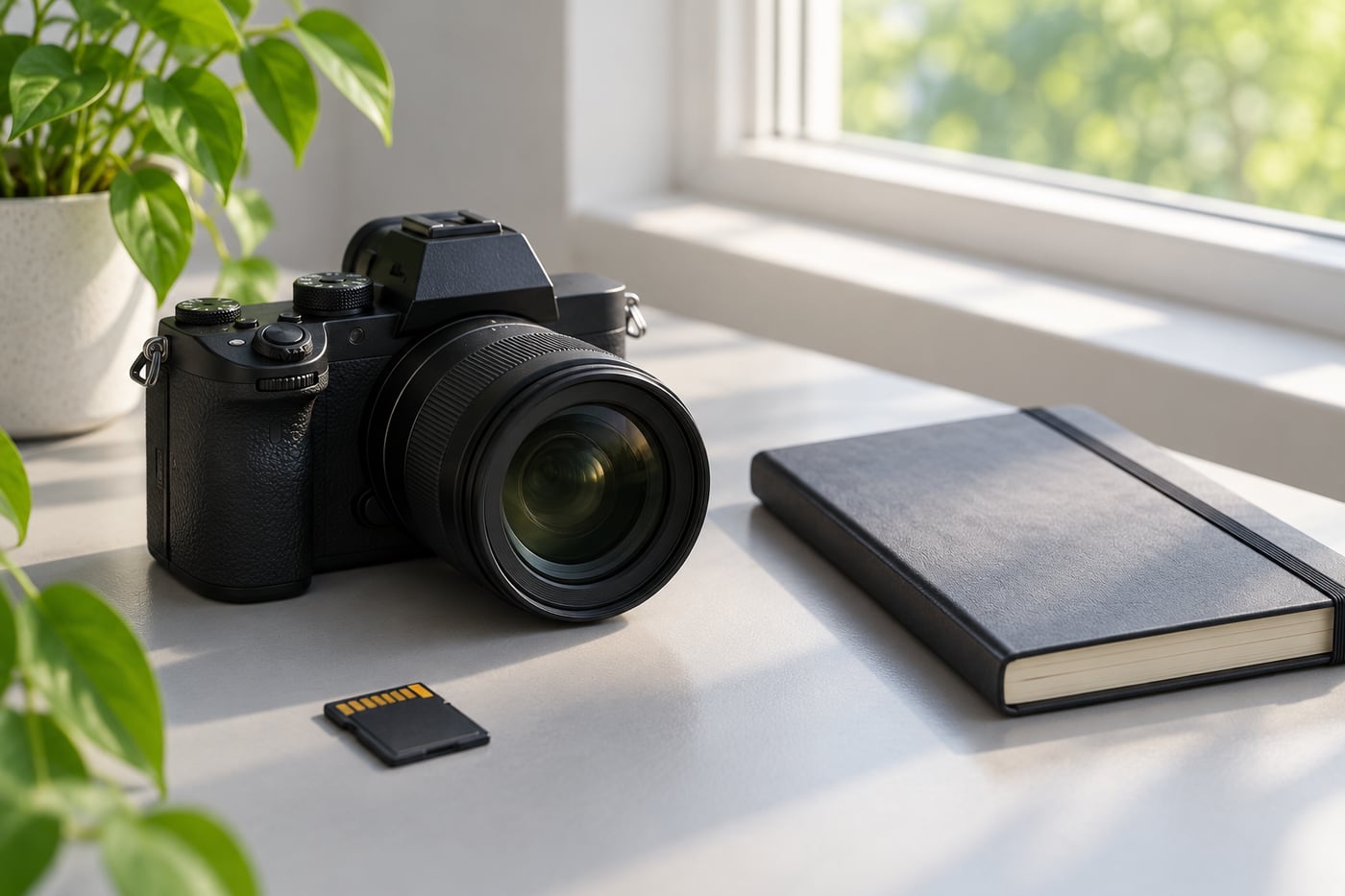
    A workflow you can finish after the shoot. Before choosing RAW, check that your editor supports files from your camera and that you have space to keep the originals. JPEG can be useful when you need a ready-to-share file quickly; RAW is useful when you are prepared to process it. The choice should fit the actual lighting and editing task.

    Unbranded camera and memory card beside a notebook
    AI-generated teaching illustration. It shows the scene discussed here, not a measured camera test.

    What the camera does to a JPEG

    A JPEG contains the camera’s processing choices, including colour, contrast, sharpening, and noise reduction. The camera has already converted the captured data into a familiar image. That is why JPEGs open on most phones and computers, attach easily to a message, and are convenient for a quick delivery.

    Many cameras let you adjust picture styles, white balance, and contrast before taking the photograph. These settings influence the JPEG. Some camera previews also show an embedded JPEG even when you record RAW, so the playback screen is not always a direct preview of how the RAW file will look in editing software.

    You can edit a JPEG. Exposure, colour, crop, and local adjustments are all possible. The limitation is that the image has already been processed and compressed. Large changes to brightness or colour can reveal banding, noise, or lost detail, especially in skies and shadows. Repeatedly saving a JPEG can also add compression damage. Keep the original and export a new copy after editing.

    What a RAW file gives you

    A RAW file stores data from the camera sensor along with metadata that tells compatible software how the image was captured. The software renders that data into a viewable photograph. You choose how to interpret white balance, contrast, sharpening, and other adjustments, then export a JPEG or another format for sharing.

    This extra control helps when the light is mixed, a scene is slightly underexposed, or you want to decide the colour treatment later. It does not mean that every RAW photograph will look better by itself. The first rendering may appear flatter or less saturated than the camera’s JPEG because the camera’s processing has not been applied in the same way.

    RAW files are commonly larger than JPEGs, though the exact size depends on camera, image content, bit depth, and compression settings. They also need software that supports your camera model. Check support for the exact model, especially if it is new. A program that reads RAW files from one camera may not yet recognise files from a later release.

    RAW cannot repair every capture problem

    A RAW file gives more latitude for some tonal and colour adjustments, but it cannot restore focus that landed on the background or remove motion blur caused by a slow shutter. If a bright area is clipped in the sensor data, detail may be gone. If the subject moved during the exposure, changing the file type will not freeze it.

    It is still worth checking the photograph while you can take another frame. Zoom in on a test image when focus is critical, watch the histogram if you understand it, and make another exposure when highlights or shadows are important. A well-exposed JPEG can be more useful than a poorly focused RAW file.

    When JPEG is the sensible choice

    JPEG is a good fit when you want files that are easy to view, upload, print, or send without a separate editing step. It can suit travel notes, family records, classroom exercises, quick event previews, and situations where you need to deliver a finished image soon after capture.

    It is also a practical format when storage or computer space is limited. The smaller files leave more room on a card and make backups quicker. If you are learning exposure and composition, a simple JPEG workflow can help you spend your attention on the photograph rather than managing a long editing queue.

    Choose a JPEG quality setting appropriate for your use. A high-quality setting is usually preferable when you may crop or print later. If your camera offers different image sizes, check the manual so you understand the trade-off before an important shoot.

    When RAW earns the extra work

    RAW makes sense when you expect to edit the photographs and want greater flexibility over the final rendering. It is especially helpful when white balance may need correction or when you want to adjust shadows and highlights carefully. This can be useful for landscapes, interiors, and other scenes with a wide range of tones, although exposure and lighting still matter more than the file label.

    Choose RAW only after you have a way to import, edit, export, and back up the files. The workflow can be straightforward once set up, but it adds steps. Store the untouched originals somewhere safe and export finished copies to a separate folder. Avoid treating a catalogue or cloud preview as your only backup.

    RAW + JPEG: useful for learning

    If your card has space, recording both formats for a short trial lets you compare their behaviour. Photograph a still subject in steady light. Keep the JPEG unchanged, then process a copy of the RAW in software that supports your camera. Try a modest white-balance change and a small brightness adjustment. Export the result as JPEG so both files can be viewed side by side.

    Compare the files at the same size and on the same screen. Look at skin or neutral objects for colour, check shadows for noise, and inspect bright areas for detail. Do not compare a camera JPEG against a heavily edited RAW export and conclude that the format alone caused the difference. Keep your changes restrained so you can learn what each file offers.

    Recording both creates two files for each frame. Decide how you will name, group, and back them up. Some programs pair the RAW and JPEG automatically; others show them separately. Learn how your software handles pairs before deleting either version.

    A simple decision for your next shoot

    • Choose JPEG if you need a finished file quickly and prefer a light workflow.
    • Choose RAW if you plan to edit and have confirmed software support and storage.
    • Choose RAW + JPEG for a limited comparison when you are learning, then review how many files you actually use.

    Whatever you select, make a test photograph and check it on a computer or phone before an important session. Confirm that the file opens, looks as expected, and can be backed up. Small preparation now can prevent a frustrating surprise after a full day of shooting.

    Export and keep your originals

    For ordinary web sharing, JPEG in sRGB is a practical starting point because browsers and devices widely support it. Use an image size that suits the destination, and keep a full-resolution original if you might print or crop later. Your editor may offer other formats for particular tasks; check the recipient or platform requirements rather than assuming one export fits everything.

    Keep capture files separate from exported versions. Use clear folder names by date or project, and make a second copy on a different device or service. An export is a finished viewing copy, not a substitute for a backup of the original file you intend to preserve.

    Related lessons

    Sources and further reading

    Adobe: Camera Raw files and JPEG processing.

  • Why a Wider Lens Does Not Automatically Fit More Into a Better Photo

    Published: Updated:

    A wider view can bring the room, window, floor, and ceiling into the frame. Check whether those details help explain the subject before including all of them.

    Leave room to change your viewpoint

    A safe location where viewpoint can be changed. Use the same subject and pay attention to your camera position as well as focal length. If you move closer to keep the subject large with a wider lens, nearby objects become more prominent relative to the distance behind them. Do not step into a road or restricted area to reproduce a composition.

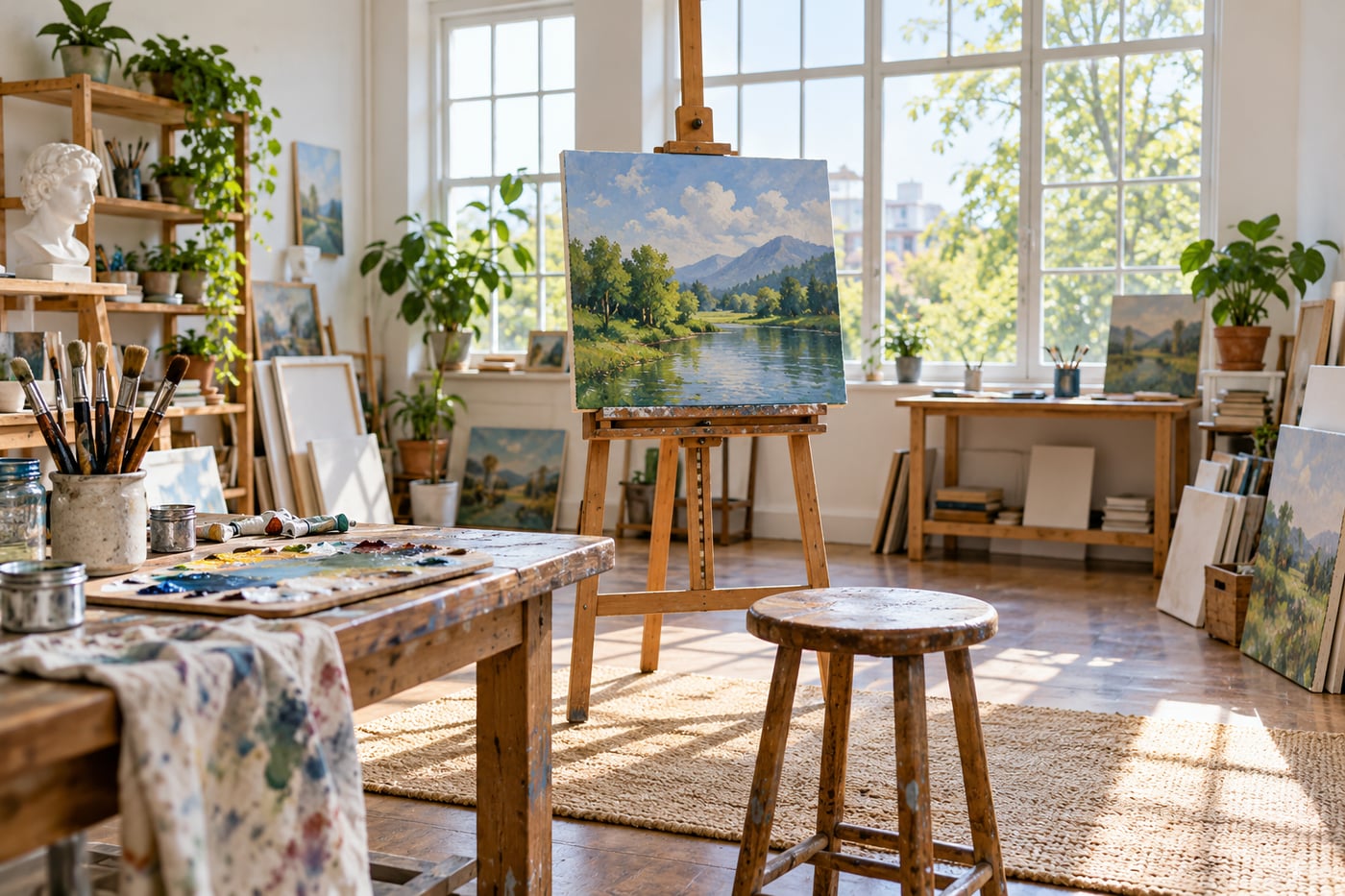
    Wide view of a bright art studio with an easel and foreground stool
    AI-generated teaching illustration. It shows the scene discussed here, not a measured camera test.

    Choose what the extra space explains

    A wider view can connect a subject to its surroundings: a person in a workshop or a tree beside a path. If the extra space only adds furniture, signs, or bright corners, a tighter frame may communicate more clearly.

    Before zooming wider, finish this sentence: “I want to include the surroundings because…” If the answer is unclear, make a narrower version for comparison.

    Close objects can dominate

    Using a wide view often encourages you to move closer. From a close viewpoint, nearby objects look larger relative to distant ones. A foreground rock can become an anchor; an accidental hand near the lens can become a distraction.

    This relationship comes from camera position. Changing focal length from the same position changes framing. Moving the camera changes perspective. Keep that distinction in mind when comparing lenses.

    Check all four edges

    A wide frame can gather details you did not notice while looking at the subject. Scan the edges for bright lamps, half-visible people, and awkward cuts. Also check whether important objects near the corners look stretched in a way you dislike.

    For people, avoid placing faces very close to the edges of an extremely wide view unless the effect is deliberate.

    Watch camera tilt around buildings

    Pointing the camera upwards makes vertical lines converge. This can communicate height, but it may be distracting in a straightforward room photograph. Keeping the camera level changes the framing and can reduce convergence.

    Perspective corrections in editing can require a crop and stretch detail. Leave room if you expect to correct the frame later, and inspect the result rather than assuming software will solve it cleanly.

    A useful comparison

    1. Choose a subject with a clear surrounding setting.
    2. Make a wide frame from your first position.
    3. Make a tighter frame without moving.
    4. Move and make a new wide frame that removes one distraction.

    Compare context, foreground scale, and the edges. Read focal length and camera position and composition for the next experiment.

    Related lessons

    Sources and further reading

    Adobe: viewpoint and composition.

  • How to Choose an Autofocus Area for a Still Subject

    Published: Updated:

    The camera focuses quickly, but on the bookshelf behind your cup. A large automatic focus area found something with clear detail. That was not necessarily the subject you wanted.

    Begin with a subject that stays still

    A subject that can hold roughly the same position. Choose one clear feature, such as the nearer eye or a product label, and compare repeated frames without changing your composition radically. A subject turning towards you is no longer the same still-subject exercise. Small focus areas can also struggle over plain surfaces with little contrast.

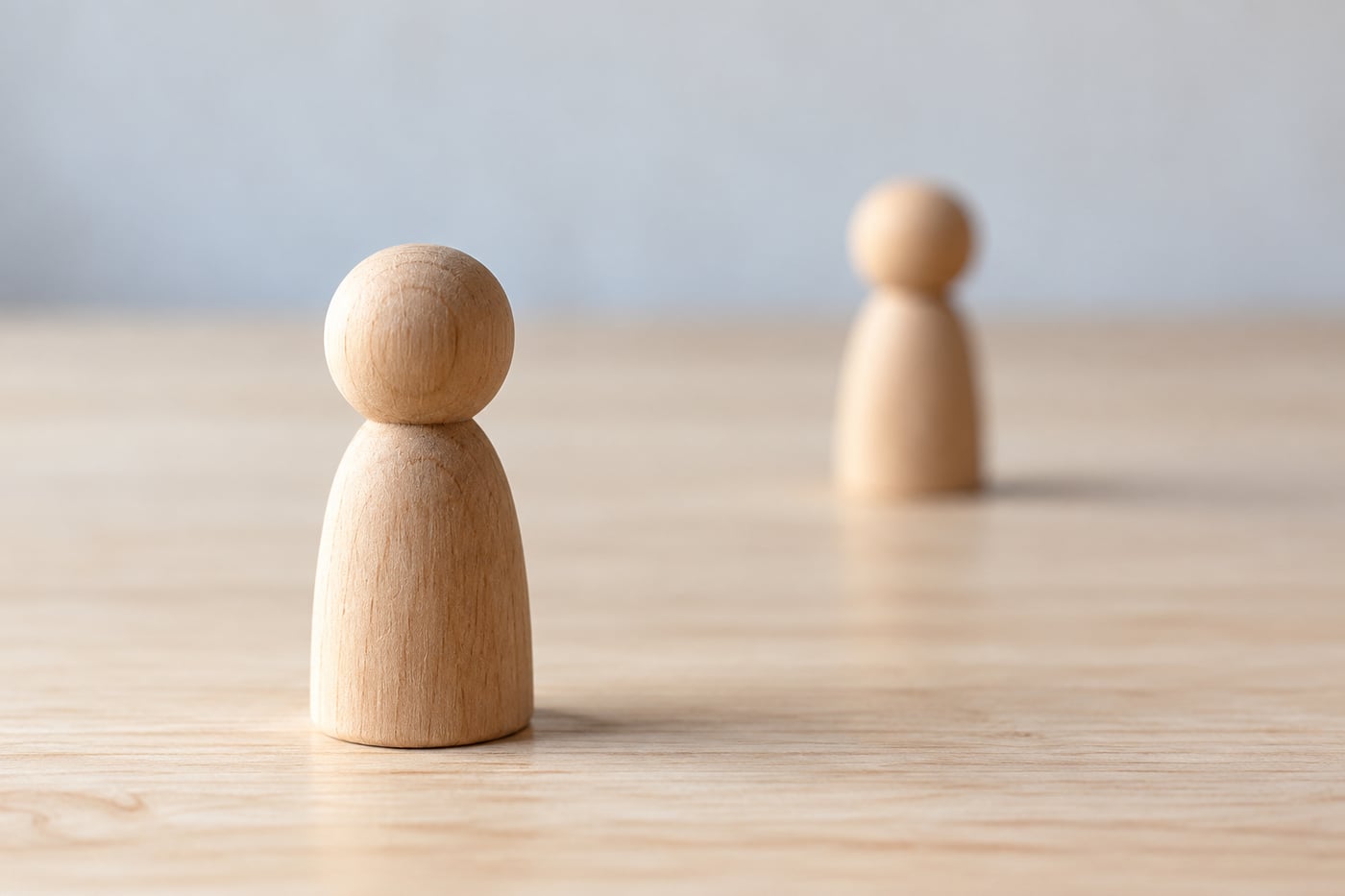
    Near wooden figure in focus with a farther figure softened
    AI-generated teaching illustration. It shows the scene discussed here, not a measured camera test.

    Focus mode and focus area do different jobs

    The autofocus mode controls how focus responds over time. Single autofocus generally acquires focus for a still subject; continuous autofocus keeps updating for movement. The focus area controls where the camera looks.

    For a stationary object, single autofocus with a small selectable area is a manageable starting point. Your camera may call the area a point, spot, or flexible spot.

    Put the area on useful detail

    Choose an edge or textured part at the distance you want sharp. A plain white surface, reflection, or very dark area can be difficult for autofocus. Moving the point to a clearer detail on the same plane can help.

    On a face, the nearer eye is often a useful target. Eye detection can help, but confirm which eye the camera selected and review the result. After using eye detection, magnify the selected eye in playback to check the focus.

    A very small area is not always better

    A tiny point offers precise placement but can miss a subject when you or the subject moves. A slightly larger area can be easier to keep on a person. It can also include background detail, so check where focus actually lands.

    Try two area sizes on the same subject. Compare consistency as well as sharpness. The smallest option is useful only if you can place it reliably.

    Be careful with focus and recompose

    Focusing in the centre and then turning the camera to reframe can shift the relationship between the focus plane and subject. At close distances with shallow depth of field, the eye may become soft. Moving the focus point towards the intended position avoids a large reframing movement.

    Review the important detail

    Magnify the subject in playback. If a background edge is sharp and the target is soft, check focus selection. If both show directional streaks, investigate camera shake. A slow shutter can spoil a frame even when autofocus selected the right distance.

    Place a cup in front of some books. Focus on a clear edge of the cup, then on the books, without moving the camera. Magnify both files and compare which distance is sharp. Continue with focus and sharpness and portrait practice.

    If you sway forwards and backwards while shooting, reconsider focus mode, aperture, and your stance. A smaller focus area alone will not keep the subject at the same distance.

    Related lessons

    Sources and further reading

    Nikon Z50 manual: focus mode (model-specific example).

  • Aperture Priority: What to Check Before You Press the Shutter

    Published: Updated:

    You select f/2.8 because you want a soft background, take the picture, and find the subject blurred. In aperture priority the camera chooses shutter speed to match the light, so the aperture is only one part of the exposure. The mode is useful when you want to control depth of field, provided you check what the camera chooses in return.

    On most cameras this mode is marked A or Av. You select an aperture and the camera meters the scene, choosing a shutter speed. ISO may be fixed or automatic, depending on your settings. Names and options vary by model, so check the manual if a control behaves differently from what you expect.

    Start in steady available light

    Available light and a subject with manageable movement. The camera chooses shutter speed after you choose aperture, so watch that speed as the light changes. A still vase, a talking person, and a running child need different decisions. Check your Auto ISO range and minimum shutter-speed options if your camera provides them.

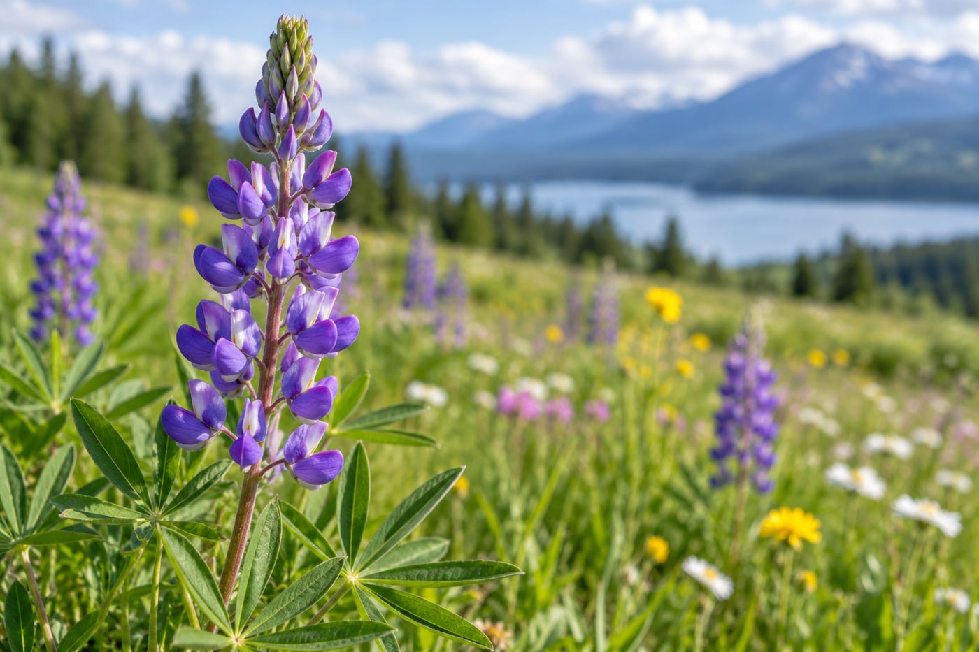
    Sharp purple flower against a softer meadow background
    AI-generated teaching illustration. It shows the scene discussed here, not a measured camera test.

    What aperture changes

    The f-number controls the lens opening. A lower number means a wider opening, which lets in more light and can produce a shallower depth of field. A higher number means a smaller opening, which lets in less light and can keep more of the scene acceptably sharp. Depth of field also depends on focus distance, focal length, and the camera format. Two photographs at the same f-number can therefore look different.

    A wider aperture can help separate a portrait from a distracting background. It can also make focusing less forgiving, especially at close distance. If the subject turns slightly, an eye that was sharp may no longer be. For a group, a very wide aperture may leave one person sharp and another soft. Stop down a little or arrange people on a similar plane, then check the result.

    A narrower aperture is often useful when several distances matter, such as a flower close to the camera and a landscape behind it. It does not make every part of the scene sharp automatically. Focus distance still matters, and very small openings can reduce fine detail through diffraction. Use a test frame and view it at the size that matters for your work.

    The shutter speed still matters

    The camera can select a shutter speed that gives the correct average brightness but is too slow for movement. A still building may remain sharp at a speed that blurs a walking person. A child running towards the camera usually needs a faster shutter than a person sitting still. Handheld camera movement can soften the whole frame, while subject movement often blurs only the moving parts.

    When the speed is too slow, consider raising ISO, opening the aperture, adding light, or changing position to support the camera. Each choice has a cost. Raising ISO can make noise more visible; opening the aperture reduces depth of field; adding light may change the look of the scene. Stabilisation can help with camera shake but does not freeze a moving subject.

    Set Auto ISO with a purpose

    Auto ISO can let the camera raise sensitivity when the light falls, helping it maintain a more useful shutter speed. Many cameras offer an upper ISO limit and, on some models, a minimum shutter speed. Read the camera menu carefully because the options differ. A focal-length based minimum may adapt to the lens, but it still may not account for a fast-moving subject.

    Set a starting limit that you are comfortable using, then test it in the kind of light you photograph. If the camera reaches the limit, it may choose a slower shutter than your chosen threshold. Look at the exposure information after each test. A setting that works for a still interior may be too slow for a child or pet.

    Watch for exposure limits in bright light

    In bright sun, a wide aperture and low ISO may still require a shutter speed faster than the camera can provide. Some cameras display a warning or blink the shutter value. Narrow the aperture, lower ISO if possible, or use appropriate light control. A neutral density filter can reduce incoming light in some situations, but know how it affects exposure and autofocus on your camera.

    Flash adds another constraint. Cameras have a maximum sync speed for many flash setups, and high-speed sync is not available with every flash or camera. Check the camera and flash manuals before relying on a particular combination. Aperture priority does not remove those limits.

    A short practice session

    Place a stationary subject near a background with some distance behind it. Use steady daylight so the light does not change much during the comparison. Set A or Av, choose a fixed ISO for the first round, and make one frame at a moderate aperture, one wider, and one narrower. Keep your position and focus point the same.

    Compare the background blur and check the subject’s important details at full size. Then make another round with Auto ISO enabled. Watch the shutter speed and ISO for each frame. You are learning two things: how the aperture changes the appearance of the scene, and how the camera adjusts exposure around your choice.

    Repeat with a person who moves slightly. Your still-subject results will not tell you which shutter speed will freeze a gesture. Make a few frames at different apertures and inspect the eyes and hands. Choose a depth of field that suits the subject, then make sure the shutter speed is adequate for its movement.

    When to switch modes

    Aperture priority is handy when depth of field is your main concern and the camera has room to choose a suitable shutter. Switch to shutter priority, often marked S or Tv, when motion blur or freezing action is the priority. Manual exposure can be useful under steady light when you want fixed control over both values. No mode can make the decision for you when the scene changes quickly.

    If the photograph is too bright or dark, check the meter and exposure compensation. A scene with lots of snow or a large dark background can fool a reflective meter because it tries to render the scene near a middle tone. Learn the adjustment in How to Use Exposure Compensation When Your Camera Gets Brightness Wrong.

    A quick pre-shutter check

    • Is the chosen aperture suited to the depth of field you want?
    • Is the camera’s shutter speed suitable for handholding and subject movement?
    • Is Auto ISO enabled and limited in a way you understand?
    • Are important highlights or shadows at risk of losing detail?
    • Did focus land on the part of the subject that matters?

    After taking the frame, review it and make one adjustment at a time. If you open the aperture, check both depth of field and the new shutter speed. If you raise ISO, check whether the shutter became fast enough. This small habit makes the mode predictable and helps you understand why a photograph changed.

    Related lessons

    Sources and further reading

    Nikon: aperture and exposure basics.

© 2026 CaptureView. All rights reserved.